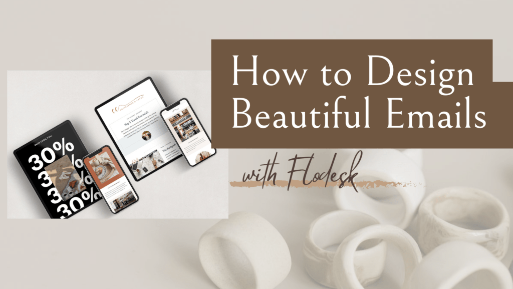
If there’s one thing I’m SO glad I learned how to master this year, it’s creating really beautiful emails —that ACTUALLY get click-throughs!
There’s a lot of advice out there when it comes to creating email design templates and newsletters, email design best practices, whether to use an html editor… the list goes on and on.
As someone who is a perfectionist, I can say with confidence that sending out Newsletters has become one of my favorite things to do, simply because I truly have so much fun creating them for my readers!
So, let’s get into it. The Ultimate Guide to Creating Beautiful Emails- everything you need to know plus which softwares I use, and (SURPRISE) A VIDEO that goes over my EXACT process on how I put together my newsletters!
You can read this entire blog post for an in-depth description of how to create beautiful Newsletters OR if you’re a more visual person (like me), you can watch the video at the end, which goes into all the nitty gritty details.

#1. Choose your Newsletter Platform
While it is possible to download free plug-ins and send emails through your hosting site alone, I do not recommend doing that.
When it comes to building up an email list, you want to invest in a Newsletter Platform, whose GOAL it is to help you grow your business and increase your sales.
My personal pick? Flodesk.
If it’s not already apparent from my website and IG account, I live for creating aesthetically pleasing content. When something that looks good, I gravitate towards it. The same thing goes for emails, IMO.
When I receive an email that is bland, no colors, no photos, and not a great layout, it doesn’t matter how good the content is, I am not tempted to read it. Unless there is a link included which looks interesting, I might give it a glance. However, more times than not they end up in the trash.
FLODESK
Flodesk as been an absolute game changer when it comes to creating emails. I do have experience with two other softwares, Mailchimp and Constant Contact, they do not even come close.
Depending on your goals, Flodesk lets you create everything from welcome emails to sharing news, making money, inspiring, saying thanks, creating quizzes, freebies, announcements and SO. MUCH. MORE.
Not only that, but every template you choose from allows you to customize everything from your brand colors, to photos, layouts, links, fonts, design details, and again, so much more.

The pre-made templates are a HUGE bonus, because you don’t have to spend time thinking about what works and converts. They’ve already done the work for you, and made it super easy to drag-and-drop, and change blocks as you wish.
If you’d like to try out Flodesk for yourself, I have a discount link that gets you 50% off your first year! Try them out here.
#2- Pick a General Layout
You can always adjust this as time goes on, but pick a general layout for the content you’d like to send out in your emails.
Do this exercise below when deciding on your email layout 👇🏽
- What are 3 content blocks I want to share in EACH email?
- Ex: weekly feature, blog recap, related posts, recent posts, a valuable offer (example- include a potential collab opportunity you found every time you send an email), weekly wrap up, featured blogger of the week, featured place of the week, featured item of the week etc… do you see what I’m getting at?
- How many photos am I going to include?
- Try to have a general idea of how many photos you plan to include in each email, and what the format of those photos will be.
- For example, I have a saved template on CANVA that I use for all of my Flodesk emails. Try to keep your photos consistent with similar formats/layovers/text writing etc.
- Decide what content you’re going to pull from where
- Are you active on multiple platforms? Maybe you’re on IG, YT, TikTok, and your blog (first of all, if this is you HATS OFF).
- Make sure you do not overwhelm your reader. I recommend picking 2 AT MOST, should be your highest performing/converting, and sharing content from only those platforms in your email.
PSA- for point #3, you can still include all of your social media links in your email footer so don’t worry about people not finding all your content!
#3- Stick with a Consistent Theme
When my subscribers receive my emails, they know what to expect. They are getting ‘X’ type of content, written in ‘Y’ format, with access to ‘Z’ resources.
The way that you can stay consistent is by duplicating your email outbounds. After my first ever email went out, I wanted to stick to the same format while being able to slightly change elements when I felt like it.
SO, instead of creating a ‘new email’ for each newsletter than went out, I will simply “duplicate” my last email, and make edits from there.
*MAKE SURE*- If you’re using this method, you need to be careful to change hyperlinks & URL’s, as well as the segment(s) that the email is going to.
This has saved (me, personally) so much time when creating newsletters, as I know I don’t have to go in and design “new” templates each time.
I HIGHLY recommend watching the video below to see the exact process of this live 👇🏽😍
Sending out Newsletters does NOT have to be daunting. It can be fun and so rewarding when you use a platform you love, and get into the swing of things!
Before creating an email list and starting up my Newsletters, I was super intimidated. But, now I feel empowered! Plus- it really does feels AMAZING when people acknowledge all the hard work you’ve put into them! 🫶🏼